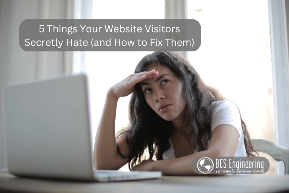
You’ve put time and effort into building your website—but if visitors are bouncing quickly or not converting, something might be off. Many common website issues are small and easy to overlook, but they can have a big impact on how people perceive your business. Let’s break down five things that might be turning your website visitors away—and how to fix them.
1. Slow Loading Times
We’ve all clicked on a website that took forever to load—and let’s be honest, most of us didn’t wait. Slow-loading pages are one of the fastest ways to lose a visitor before they even see what you offer. Whether it’s oversized images, bloated plugins, or poor hosting, the longer your site takes to load, the higher your bounce rate climbs.
Fix it:
Use tools like Google PageSpeed Insights or GTmetrix to test your speed and identify what’s slowing you down. Compress your images, use browser caching, and consider upgrading your hosting plan if needed. A faster site makes for a better first impression—and keeps people around longer.
2. Annoying Pop-Ups
Pop-ups can be effective, but only when they’re well-timed and not overly aggressive. If someone lands on your site and is immediately bombarded with a giant pop-up, it interrupts their experience and can feel pushy. Worse, if it’s hard to close or appears multiple times, it becomes downright frustrating.
Fix it:
Set pop-ups to appear after a visitor has scrolled or spent time on the page—give them a chance to get settled. Always include a clearly visible and easy-to-click close button. Used thoughtfully, pop-ups can convert—used poorly, they’ll send people running.
3. Confusing Navigation
Your site’s navigation should act like a helpful guide, not a maze. If your menu is cluttered, uses unclear labels, or hides important pages, visitors may give up before finding what they need. People won’t spend time trying to figure things out—they’ll just leave.
Fix it:
Keep your menu simple and focused. Use clear, familiar terms like “Home,” “Services,” “Shop,” or “Contact.” Make sure it’s easy to move around your site without hitting dead ends or getting lost.
4. Walls of Text
When someone lands on a page that looks like a term paper, it’s easy for them to feel overwhelmed. Big blocks of text are hard to read—especially on mobile devices where space is tight. Visitors are often skimming for answers, and if they can’t find them quickly, they’ll click away.
Fix it:
Break up your text into short paragraphs, and use headings to organize your content. Add bullet points or bold key phrases to help guide the eye. A clean layout with plenty of white space makes your content feel more approachable and easier to digest.
5. No Easy Way to Contact You
Nothing is more frustrating than needing help or wanting to ask a question and not knowing how to reach someone. If your contact info is buried or missing, it sends a message that communication isn’t a priority. That can cause potential customers to lose trust—or go to a competitor instead.
Fix it:
Make your contact information easy to find by placing it in the footer and linking to it in your main menu. Offer multiple contact options if possible—like a form, email address, and phone number. A clear, accessible “Contact” page helps build confidence and makes it easy for visitors to take the next step.
Make the Visit Worth Their Click
Your website doesn’t have to be perfect, but it should be easy to use and pleasant to visit. By addressing these five common pain points, you can create a smoother experience that keeps people engaged and encourages them to stick around. Small changes can make a big difference—so if any of these issues sound familiar, now’s a great time to start fixing them.
Worried that your website is repelling customers? Listen to our latest eCommerce Made Easy podcast where Carrie dives into what repels customers, how to identify the signs, and how to fix them!